|
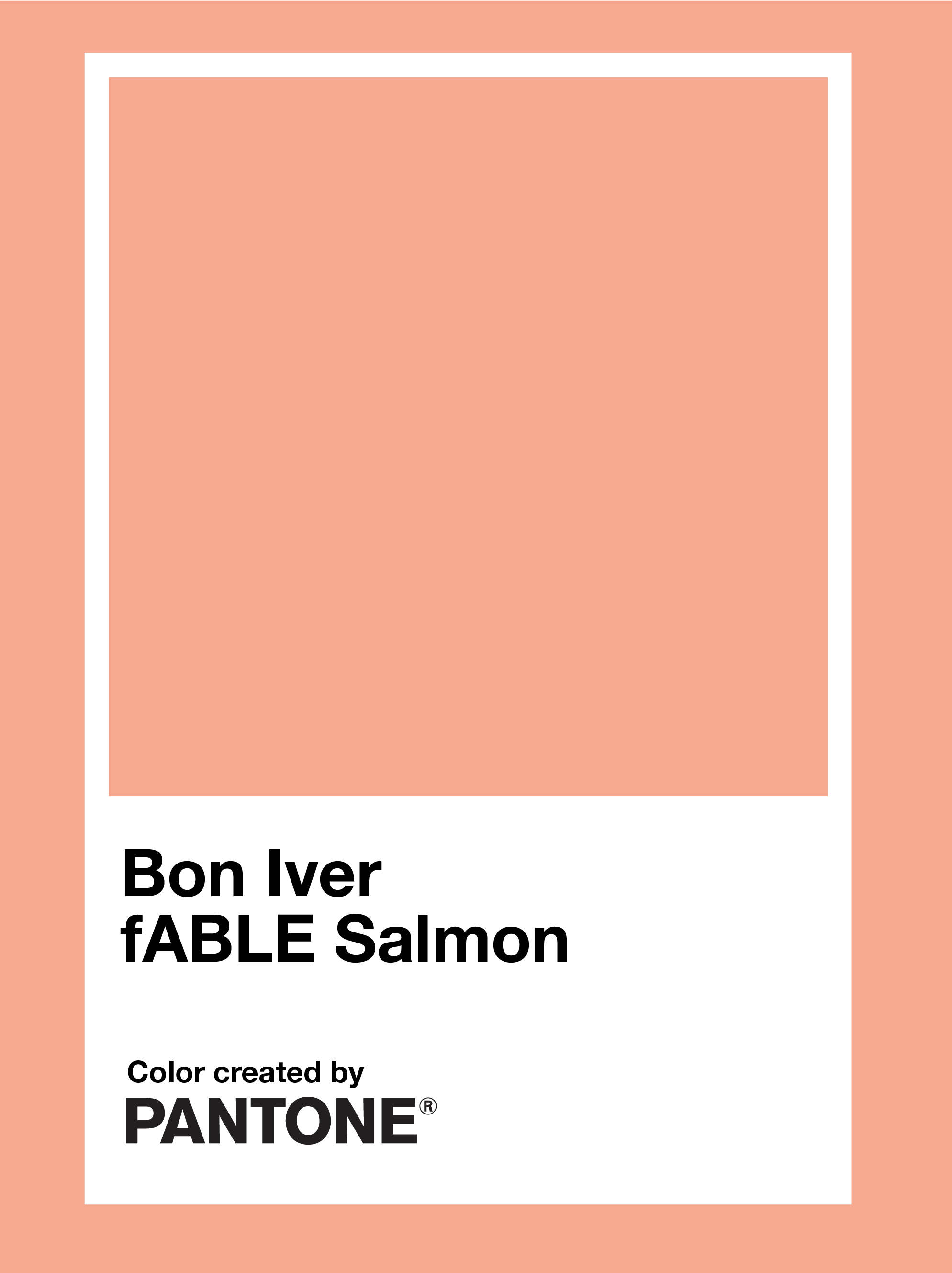
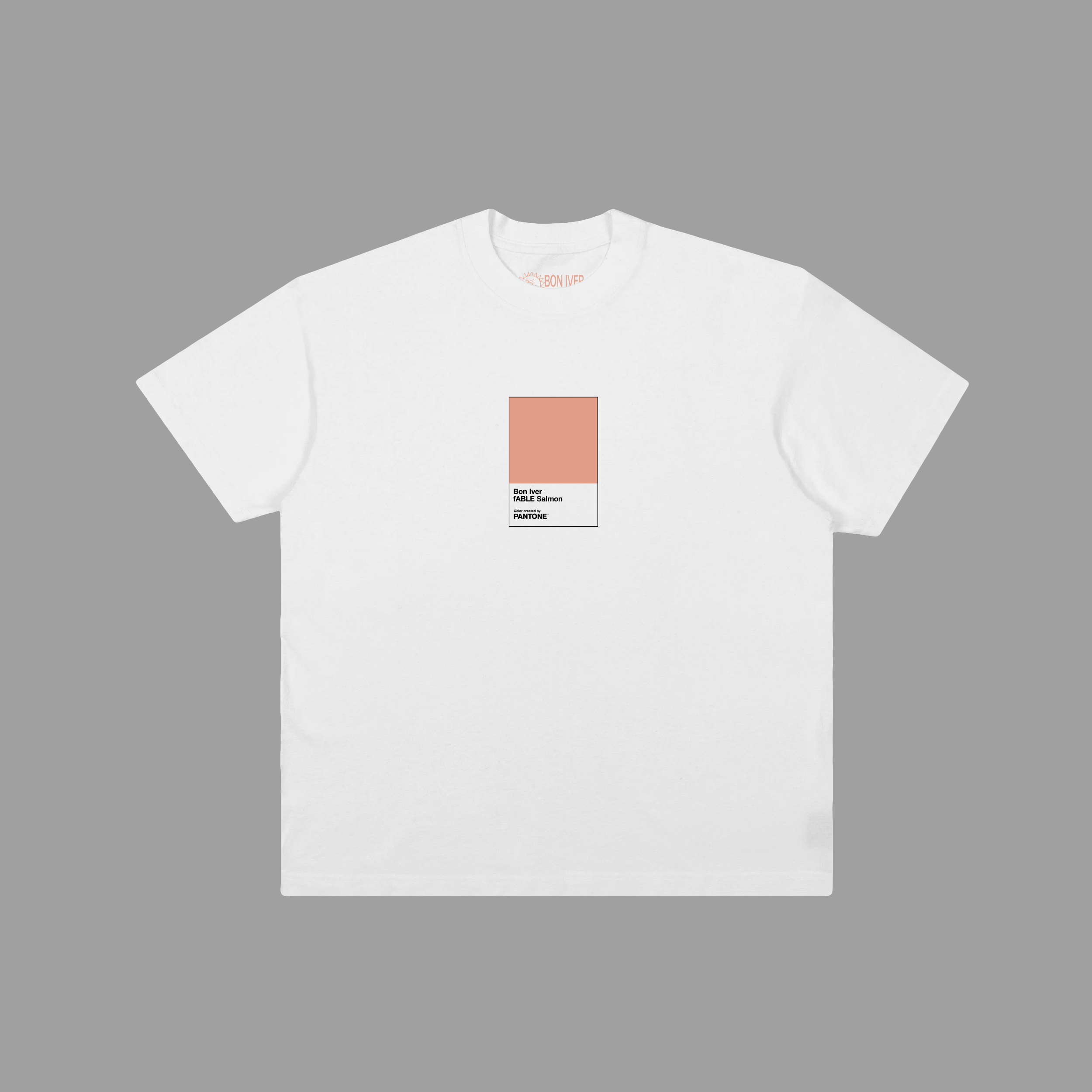
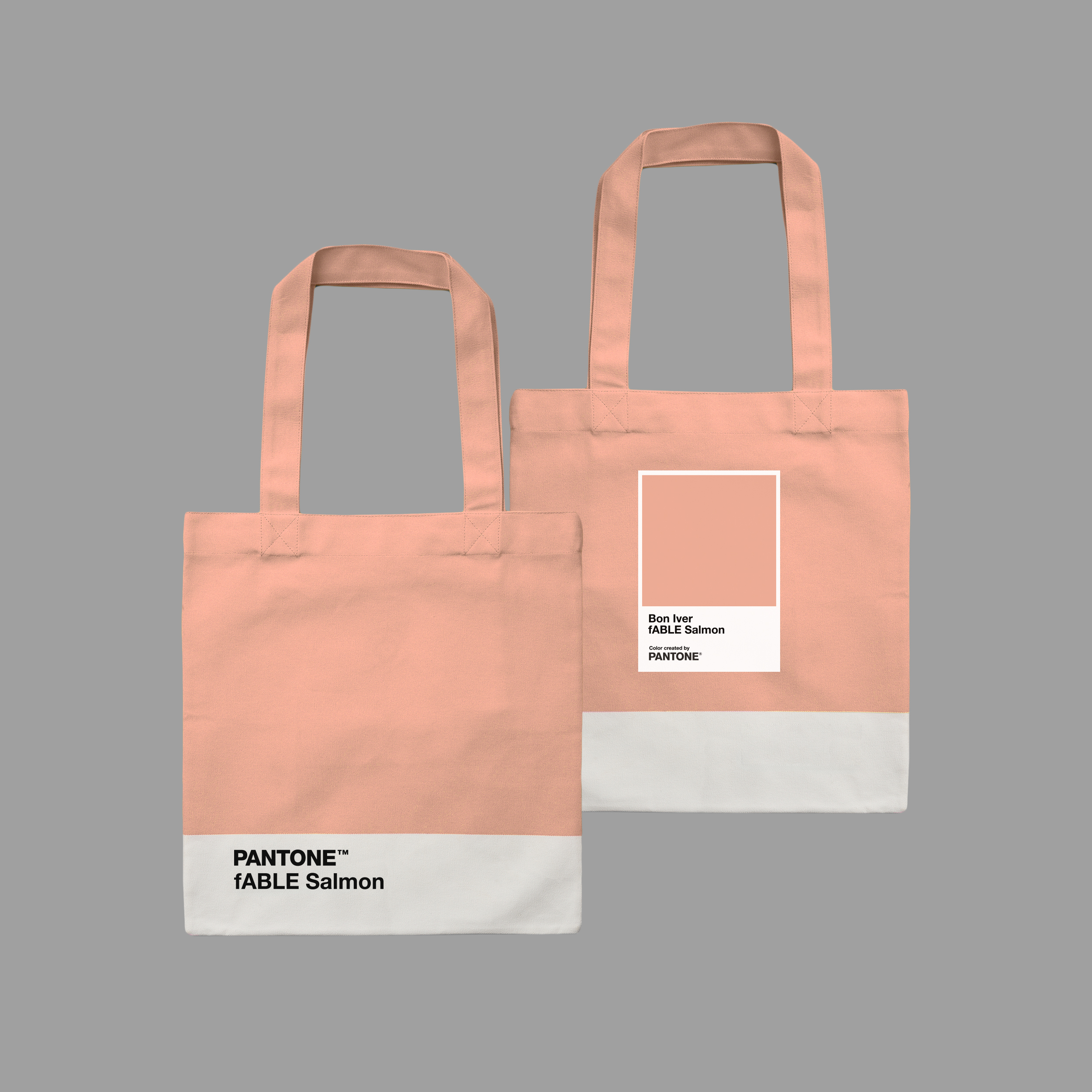
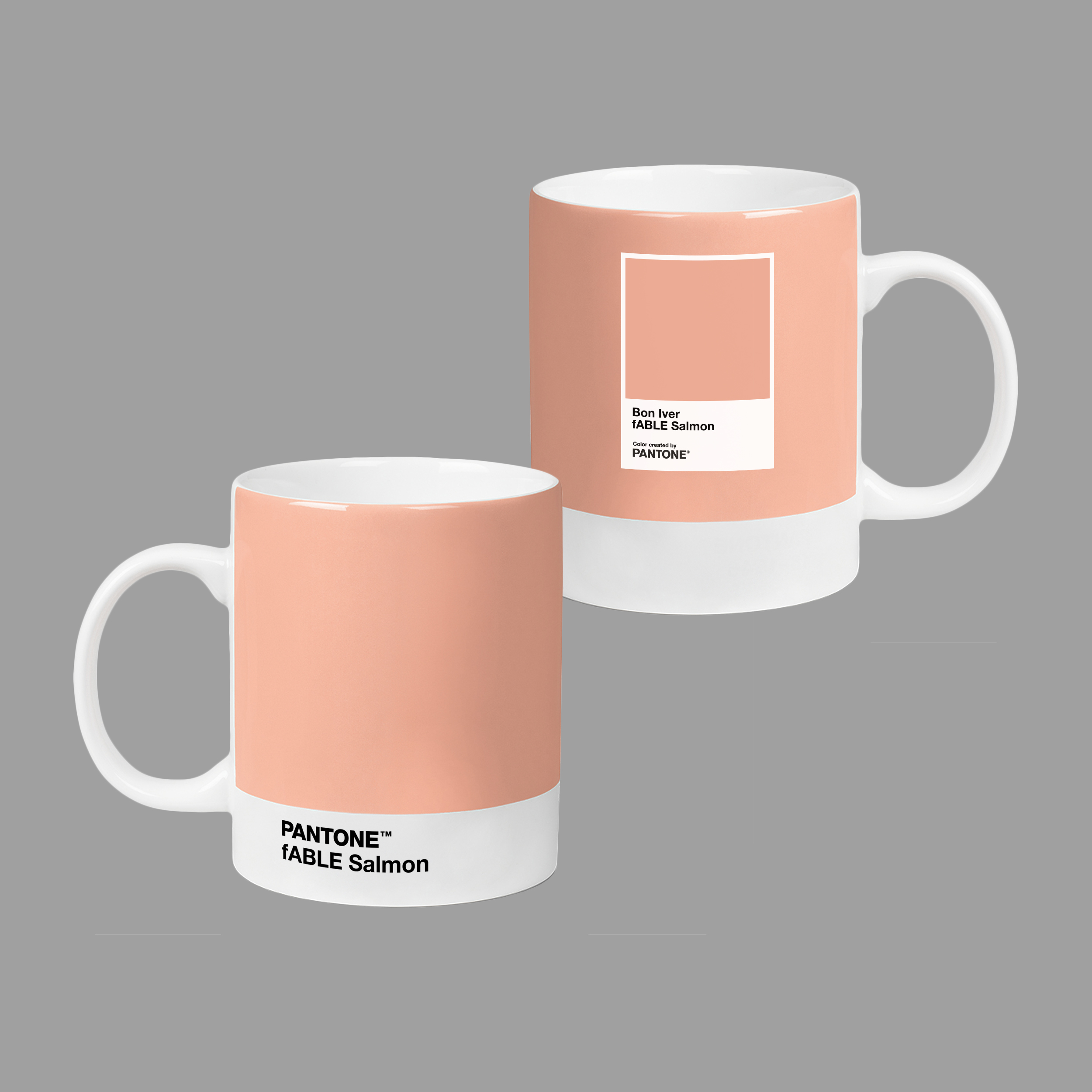
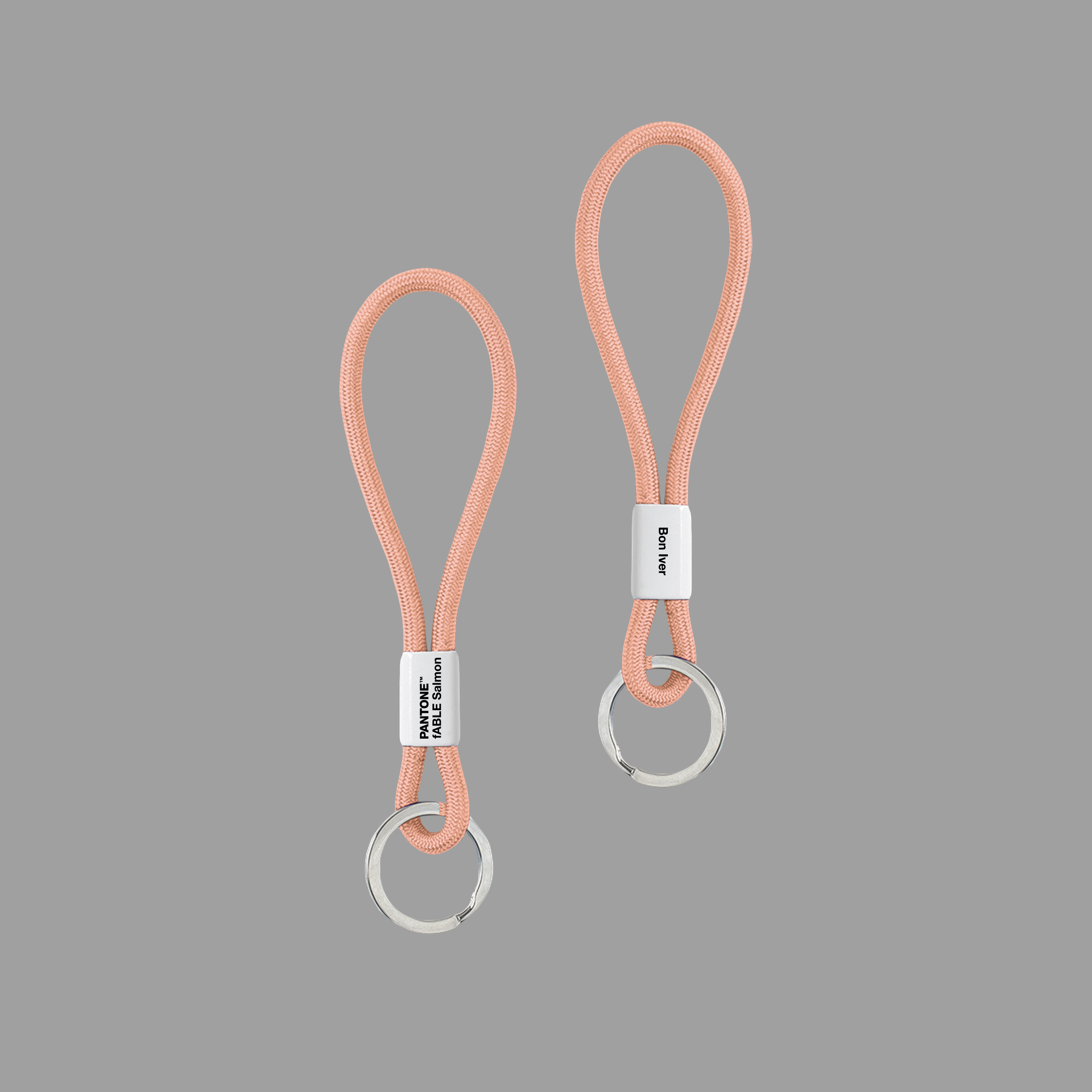
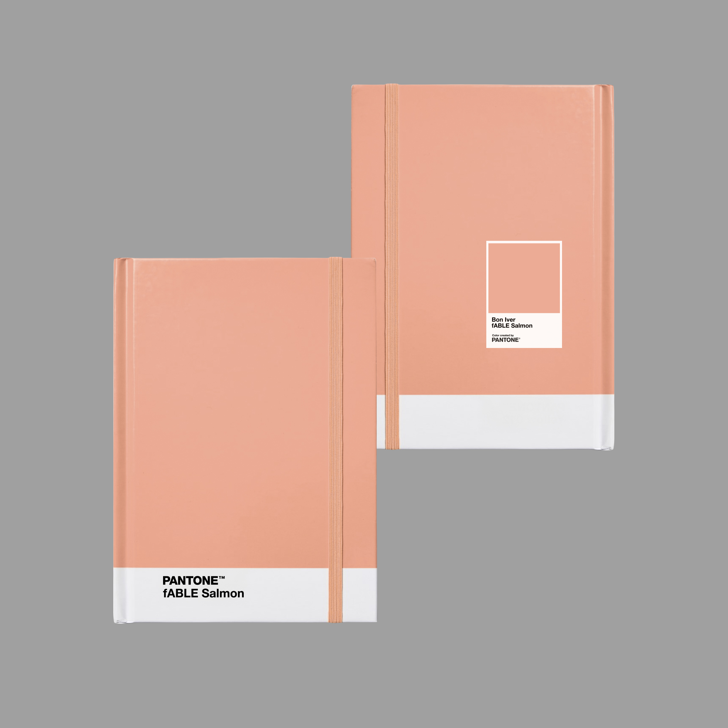
Today, Bon Iver announces a new partnership with Pantone – the global color authority and provider of professional color language standards – to celebrate the creation of fABLE Salmon: the color that has illustrated and defined the surrounding world of Bon Iver's multi GRAMMY®-nominated 2025 album, SABLE, fABLE (Jagjaguwar). From the exact hue used on the record's cover art to the joyous new tone of its music, an accompanying zine featuring bandleader Justin Vernon dressed head-to-toe in custom-dyed, salmon-color garments, the 30-pound fish he posed with in photos, and the series of global collaborations that ensued – tinned SABLE, fABLE Smoked Salmon, notebooks, hoodies and beanies, candles and mood mists, drinkable spritzes, bagel sandwiches and so much more – the colloquial "salmon" of SABLE, fABLE has now been officially inked and immortalized into the universal language of color.
"Invocation of the fish is intentional, but so are associations with other things like sunsets and the underside of skin," writes Andy Battaglia in a new story for Pantone, diving deep into the color's origins, meanings and creation process with Justin Vernon, art directors Ruben Nusz and Miles Johnson, artist Eric Timothy Carlson and graphic designer Michael Cina. "For Justin Vernon, salmon has been a favorite color since he first imagined the sun setting against the skies of Los Angeles as a self-described 'emo, Jackson Brown–listening kid' growing up in the Midwest. But his affection has grown deeper—as evidenced by a tattoo of a pink-bellied salmon on his arm, inspired by lyrics from a song by the band Ticonderoga…Vernon was adamant that the tattoo artist pay particular attention to the color of the fish itself—a realistic rendering of flesh on flesh of his own. And it offers a key to more than just what's on the surface."
"I've always thought about how, underneath our skin, no matter what the pigment is, it's this kind of salmon-belly color when it gets cut open," says Justin Vernon. "I've always thought about the humanity of it…SABLE is darkness—and the choice to go into the darkness. It's solitary. It's pressing the bruise. It's self-martyrdom and sadness. fABLE represents a new me, with new flesh for a new healthy, happy person."
"We've never done anything like this," adds Vernon, of the many salmon products and the color's ultimate manifestation in Pantone's fABLE Salmon. "But every band, punk or pop, is in a commercial, capitalist space. Old punk bands were the best brand-builders of all time. Black Flag has the best logo ever. I was like, 'Let's lean into that.'"
Read more at Pantone, and see Bon Iver fABLE Salmon on display in a new collection of collaborations with Copenhagen Designs and more: HERE
"It was fun dialing in the specific color to Justin's vision," adds Ruben Nusz, who was initially approached by Justin Vernon about a painting for the album artwork, before Vernon was fascinated by a salmon-colored frame in Nusz's studio. "Many people don't know that we see color through not only cultural biases but also through the lens of language. Color and language are inseparable. As we adjusted the color temperatures for the salmon (between cool and warm) and the hues that mix to make the color, we were careful not to make the salmon too red, too yellow, or too orange. When a color is more abstract, it's less pinned down by language—it opens up. As we perfected the color, it came to be defined by two words: Bon Iver."
"This record spoke for itself in a different way than previous records," says Miles Johnson, head of art and design at Secretly Group, whose label Jagjaguwar released SABLE, fABLE. "There's a lot of space [in cover art] that gives you access to a record, but it can also act as a barrier or stand in the way of immediate access to the record or potentially subvert or alter your perception of the music…Pantone is an element that becomes necessary to that part of the storytelling and ensuring the color comes out in every product as envisioned."
"What we see is a world obsessed with visual noise, and Justin wanted to cut it all out and reduce everything down to core elements," explains Michael Cina, the graphic designer who created the typography for SABLE, fABLE, in a custom font called Iversans. "He's interested in language and communication on a level that a lot of people are not. He values things that other people don't. He created a system to communicate. Color and type led the way."
|